Moonface Media
27 January 2012
Manipulating images-DPS
For my double page spread, i incorporated two images from my original photo shoot. The first image need not be manipulated in a different way to the other two images. All that was needed was to alter the models hair, which was done in the same way as the cover image and contents page. Yet the other image is essentially meant to be the model at an earlier stage of her career. Therefore i needed to change her entire look. To do so, i used the liquify tool to manipulate the models hairstyle and give her a much fuller fringe. Once this was done i decided to alter the models hairstyle again but to a different colour. With inspiration from Hayley Williams, i gave the model bright orange hair. This was also done to with the brush tool and the use of layers. I also decided to change the models make up style in a similar way. To do so i simply created another layer on top and then minimise the opacity of the brush tool and paint the make up around the models eyes. Once this was done i simply erased any excess paint on the image to create a very neat and realistic effect.
Manipulating images-Contents page image
 |
| In progress |
26 January 2012
Manipulating images-Cover
 |
| In progress |
My cover image was actually made up through a combination of two different images. This is because one of the images had the fist which looked most effective and the other image had a better facial expression. Therefore i simply cut the fist out of one image and copied and pasted it as a new layer on top of the other image. I then simply erased any of the background around the fist.
Once this had been completed, i decided to alter the models hair colour to reflect a more punky and rebellious style. To do so i created a new layer and selected the paint brush tool. I then altered the opacity of the tool in order to ensure the models original hair was visible through the colour. I then selected scarlet red and simply painted the models hair. Once this was done i decided to erase any of the excess paint which had gone onto the background and onto the models skin. Therefore i selected the eraser tool and erased around the models hair line which create a very neat and tidy effect. I finally flipped the image horizontally to make sure the the first was on the right side of the image.
6 January 2012
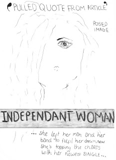
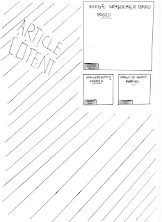
Magazine Planning- Double Page Spread Plan
 Following my mind map into different types of double page spreads, i have decided to feature a double page spread on a member of a band leaving to become a solo artist. The main article will consist of a brief narrative, introductory paragraph in order to introduce the artist and give an outline of her past. The article will then lead on to an interveiw which will illuminate the rock stars current life and how she hopes to become an extremely successful, legend of rock. It should then close through a concluding paragraph summing up the article.
  The layout of the spread itself will follow traditional double page spreads in music magazines. This would mean the majority of the first page will be dominates by a posed image. This will be headed with a pulled quote from the article in a bold colour in enlarged lettering. The headline itselfs is towards the lower half of the page and back in a transparent blue background in order to frame the writing without obstructing the main image. The headline is then followed by a short sentence written in italics breifly describing the news in which the article is covering to ensure the reader feels fully introduced.
 The layout of the second page consists mainly of the article. Yet there are also a few images included as well. There would be a posed image of the artist with her former band in order to give clear imagery as to what the artists histroy was. There would also a couple of papped shots included of the artist performing and a image of the shoot for the magazine with a veiw of the photographer too.
Magazine Planning-Contents page layout
In my magazine contents page, i wanted to create a simplistic, easy to follow structure which would draw attention to specific stories and features effectively. The colour scheme included has been followed on from my cover page in order to ensure that the magazine flows effectively. The may features have been displayed through images, the larger the image, the more important the story is. The use of a capition beneath the images helps illustrate who the picture is of and what story is represent. I also split the contents into three different sections as i found this was extremely common through my research into magazines. This was also done to ensure that the readers can find specific articles quickly and easily. The contents list going down the right side of the page consists of page numbers, the articles, and a brief explanation of what the article consists of. This helps give a breif insight as to what the article is about without giving too much away. I also featured technological convergences along the top of my magazine contents in order to help create an effective synergy between the magazine company and readers as the readers get extra stories and the magazine reader increases in popularity.
Magazine Planning-Cover Final Idea
The above image shows my final magazine cover idea fully annotated in detail. I decided to take inspiration from all of my magazine initial ideas. From idea 1, I decided to take the colour scheme from. This is because i feel that this is the most appropriate for the magazine as it is the most striking and would help the magazine stand out effectively. From idea 2, i took the idea of included a close up shot of some body punching towards a camera. The use of a violent shot, caught in a fun and interesting way helps convey the experience of a rock concert effectively which would appeal to my target audience. Also the use of such a reckless image would appeal to my target audience as they too appear ruthless and reckless. A lot of the layout was inspired by the idea as i feel that it framed the picture effectively without obstructing it too much. From idea 3, i took the idea of lack of eye contact, although it could cause the magazine to loose the connection created through eye contact. it also eliminates the pressure through having it. However i didn't take that much inspiration from idea four as i felt it was the weakest idea out of my initial. Yet i decided to feature an element which wasn't included in any of my initial ideas, a list across the bottom of my page to give an insight to the magazine content. I did this as i felt it looked much more effective that the ways it was previously done.
Magazine Planning-Cover Initial idea 4
This cover was also inspired by a Kerrang magazine which involved Hayley Williams swearing toward the camera. The use of an obscenity help create an extremely reckless impression which helps attract a tennage audience as they too are very rebellious and reckless. However it can also be perceived as offensive therefore its highly unlikely i will use this in my final idea. Again, this cover incorporates several aspects taken from my previous ideas such as the textboxes, pulled quotes, bold black lettering and listing included artists. They were used again as i feel that the reasons are justified and will look effective. The use of a bright blue title and then light blue textboxes throughout creates a very stereotypically masculine effect which would limit my target audience. Also the light blue appears to soft and delicate therefore its highly unlikely that i will incorporate this in my final Idea.
Subscribe to:
Comments (Atom)


